How do you see atmospheric perspective in a photo?
Choose a landscape photo with something close and something far away, such as hills, a road or a shoreline.
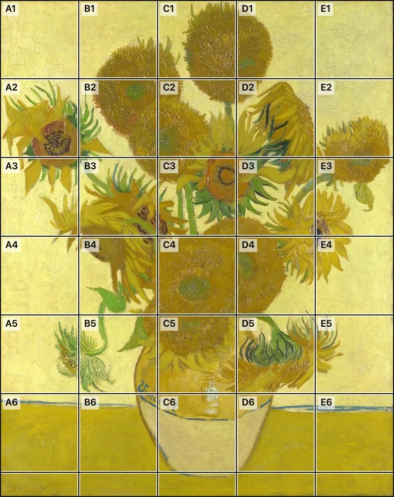
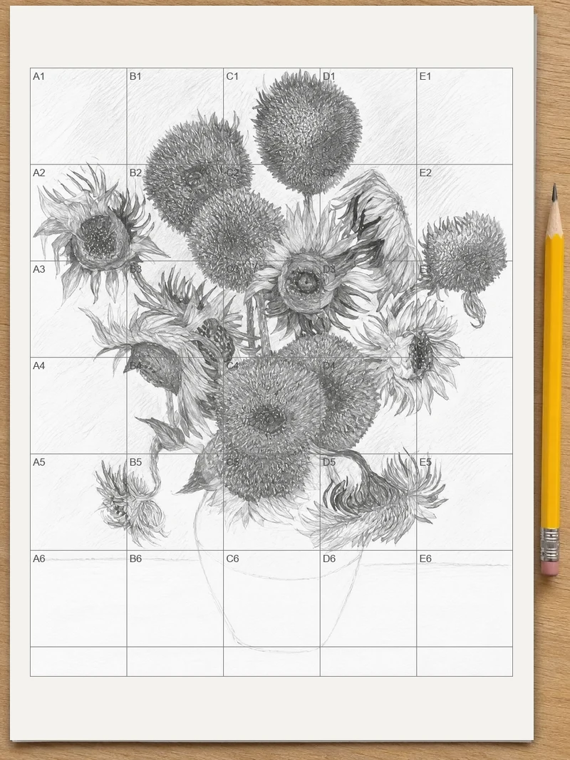
You see atmospheric perspective in a photo by comparing its parts, and a numbered grid makes that easy. Choose a landscape photo and a grid of named squares appears on it. You can then study one square at a time and watch the distant squares turn lighter, grayer and cooler than the near ones. Save the gridded photo or print it at true size to draw from. The tool is free, adds no watermark, and the photo stays on your device.
Atmospheric perspective is the way far-off things look paler, grayer, bluer and softer than near ones, because of the air between you and them. A grid splits a photo into named squares, so you can set a far square beside a near square and see exactly how much value, color and detail changed. Copy those differences into your drawing or painting and the scene gains depth.
How to use atmospheric perspective
Choose a photo with depth
Press “Choose a photo” and pick a landscape: JPG, PNG, WebP or iPhone HEIC. On a computer you can also drag the photo onto the page. Hills, fields and city views work well.
Read the grid
The numbered grid appears right away. Medium has 5 squares across the short side; choose Fewer for 3 or More for 8. Each square has a name such as A1, so you can refer to it.
Compare squares near and far
Tap a square to open it large, then use Previous and Next to walk through the squares in reading order. Compare a far square with a foreground square for brightness, color and sharpness.
Save or print the grid
Press “Save to Photos” on a phone or “Download” on a computer. Or press “Print” for two true-size sheets: the photo with its grid, and the same grid empty to draw on.
Pick a photo that shows several layers
Look for a scene with at least three planes: something close, something in the middle and something far away. A road that runs to distant hills, a harbor with ridges behind it, or a street that fades into a city skyline all work. A hazy or misty day gives the strongest effect, because the air holds more moisture and the layers separate clearly. A photo taken in sharp, dry light shows weaker fading, which is still useful if you want to learn to see small changes.
Check the light before you start. At sunrise and sunset, distant mountains can turn warm, reddish or pink instead of blue. Warm light is a real exception, so do not force a blue shift onto a photo that clearly glows orange. Compare against what the photo shows.
Compare one near square with one far square
Pick two squares that hold similar subjects at different distances, such as a tree in the foreground and a tree in the hills. Open each one large and ask the same three questions.
Write the square names next to your notes, for example “C4 is paler than A2, with less contrast.” Names like these keep a long study session organized and let you return to the same square later.
To judge value alone, turn on “Black and white photo” in the folded “Adjust grid” area. Without color, you can see how the far layers collapse into a narrow band of light grays while the foreground keeps full darks. Turn it off again to study color.
- Value: which is lighter, and how far apart are the darkest and lightest spots inside each square?
- Saturation: which has stronger, purer color, and which looks grayer?
- Hue: has the far square moved toward blue, or toward the warm color of the sky?
Use the Fewer, Medium and More sizes for different jobs
Choose Fewer when you want a quick lesson in layers. With only a few large squares, each square tends to hold one plane of the scene, so the jump from near to far is obvious. Medium suits most landscapes. Choose More when you need to place small shapes accurately, such as a distant tower, a line of poplars or a boat on the water.
If a square holds a hard edge between a dark foreground rock and a pale hill, that edge is a good place to study. In the foreground the edge should be crisp. Further back it should dissolve.
Draw it from the printed sheets
Print both sheets at 100% or actual size, and keep the first one beside you. On the second sheet, which has the empty grid, sketch the large shapes square by square. Start with the far layers and keep them light and simple. Then work forward, adding darker values and sharper edges as you reach the foreground.
A few habits make the depth read clearly:
If you want your drawing to be a certain size, open “Adjust grid” and use “Set squares in centimeters or inches” to enter your drawing width or the square size you plan to draw. The sheet also states how wide each square is, so you can mark the same squares on your paper with a ruler.
- Keep the lightest pencil pressure for the farthest hills and skip small details there.
- Reserve your deepest darks for the nearest objects.
- Soften the far edges with a blending stump or a dry brush, and keep the near edges firm.
- Overlap the layers so the eye can count them.
Painting with the same photo
Mix your farthest colors first and keep them close to the color of the sky. Add a little blue-gray to hills and distant trees, and use less pure pigment than in the foreground. Move forward in steps: each nearer layer gets slightly more color, more contrast and more texture. The squares are a handy check. Hold a swatch up to a far square on screen and ask whether your paint is paler and grayer than the near squares.
When a foreground color looks too strong against the middle ground, do not repaint everything. Gray the middle ground a little instead, so the steps between layers stay even.
Check your work with a squint and a mirror
After an hour at the drawing board, mistakes in value are hard to see. Step back to arm’s length and squint at the printed photo, then at your drawing. Details blur and the scene turns into a few broad bands of light and dark. The bands should run in the same order in both: pale far hills, a middle tone, then the darkest foreground.
Then look at your drawing in a small hand mirror. The reversed image shows a hill that is too dark or a foreground that has lost its contrast, because the eye reads it as new. Fix one layer at a time, starting with the one that stands out most.
Write a line for each square before you draw
For a careful study, give every square you plan to draw one short note: how light it is, how colorful it is and how sharp its edges are. “B2: mid gray, little color, soft edge” is enough. Squares in the same row of distance should read alike, and the notes make a jump easy to spot. A square that is darker than the one in front of it usually means a shadow or a dark object, and deserves a second look.
Keep the notes on the printed sheet beside each square. When you start drawing, you work from words as well as from the picture, and you are less likely to add detail to a far shape out of habit.
Practice with your own photos
Take a few photos of the same view at different times: early morning, midday and late afternoon. Grid each one and compare the same squares. You will see how the far hills change from pale and blue in the haze to darker and sharper after rain. Build a small habit of one study a week, and keep the printed sheets in a folder with the date and the weather.
The effect works together with size and line. When your scene includes buildings, roads or fences, the perspective grid sheet on this site gives you 1, 2 and 3 point guides for the converging lines, while the photo grid helps you with tone and color.
Run a short class exercise
An art teacher can ask every student to bring one landscape photo. Each student grids it, then writes down the names of the lightest and the darkest squares in the near and far parts of the picture. Students then compare answers in pairs. Because every square has a name like A1, the group can discuss one spot without pointing at a screen. Printed sheets also let students work without a device at the table.
Test a reference photo before you commit
Before starting a large painting, check whether your reference has enough depth. Grid it and look down one column, from the foreground square to the horizon square. If the squares barely change in lightness or color, the photo will give you a flat result, and you will need to exaggerate the fading yourself. If the change is clear, you can follow the photo closely. Press “Choose another photo” to try the next candidate and compare the two columns.
FAQ
What is the difference between linear and atmospheric perspective?
Linear perspective uses lines and size: parallel edges meet at a vanishing point and far objects are drawn smaller. Atmospheric perspective uses tone and color: far objects are paler, grayer, bluer and less detailed. These are the two main types, and most landscape drawings use both together.
What three things define atmospheric perspective?
Value, saturation and hue define it. Distant objects have a narrower range of values and lower contrast, weaker and grayer color, and a shift toward the color of the sky or haze, often cooler and bluer. Edges and texture also soften with distance.
Why is atmospheric perspective important?
It gives a flat picture the feeling of space. Without it, a far mountain and a near tree can look like cutouts at the same distance. With pale, soft background layers and strong, sharp foreground shapes, the eye reads depth, and the mood of the scene becomes easier to control.
How do you achieve atmospheric perspective in a drawing or painting?
Make each layer further back lighter, grayer and less detailed than the one before. Keep your darkest darks, strongest colors and sharpest edges in the foreground. Mix a little of the sky’s color into distant shapes. Let the hills or buildings overlap so the layers are easy to count.
What causes atmospheric perspective?
Air is never perfectly clear. Gas molecules, water droplets, dust and smoke scatter light between you and a faraway object. Blue light scatters more than red, so the distance looks bluer. Scattered light also veils dark areas, which lowers contrast and fades detail. More haze or moisture strengthens the effect.
Can you give an example of atmospheric perspective in art?
A typical example is a landscape of overlapping mountain ridges. The nearest ridge is dark, detailed and green or brown. Each ridge behind it is lighter and bluer, until the farthest one nearly matches the sky. Many landscape paintings and photographs show this stack of fading layers.
Is aerial perspective the same as atmospheric perspective?
Yes. Aerial perspective is another name for atmospheric perspective. Both describe how distant objects look paler, grayer, bluer and softer than near ones because of the air between you and them. Some books use one term and some the other, but the drawing method is identical.
Updated
Related tools
- 10x10 gridPrint a blank 10x10 grid with 100 squares in three sizes. Add numbers 1 to 100, then print the sheet or save it as a clear PNG.
 4 Quadrant Graph PaperPrint free 4 quadrant graph paper with bold x and y axes, numbered both ways from 0. Pick square size and paper, then save as PDF, PNG or JPG.
- 8x8 gridPrint a free 8x8 grid of 64 squares in your browser. Pick Small, Medium or Large squares, add letters and numbers, then print or save a PNG.
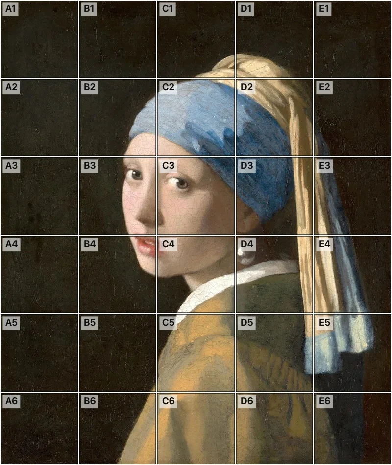 Add grid to photoAdd a grid to any photo in your browser, with no sign-up and no watermark. Get a numbered grid or a plain grid overlay, then save it or print it at true size.
- Ar TracingInstead of ar tracing with a phone stand, put a numbered grid on your own photo, then save or print it and copy it square by square. Free, no sign-up.
 Aspect Ratio CalculatorUse this aspect ratio calculator to turn a width and height into a ratio like 16:9. You also get the decimal and a resize that keeps the shape.
- Bargue DrawingPractice Bargue drawing from your own photo: add a numbered grid with 5, 8 or 12 squares across, then save it or print a gridded sheet and an empty one.
- Baroque DiagonalLay a 3 by 3 grid over your photo to see where a baroque diagonal runs, from lower left to upper right. Save it or print two sheets, free.