What is simultaneous contrast, and how do I see it in my own photo?
Simultaneous contrast is the way a color looks lighter, darker or slightly different in hue because of the colors around it, and you can see it for yourself with your own picture. Choose a photo and the page turns it into numbered shapes with one color chip for each number. A chip on its own often looks different once the same color sits beside its neighbors in the picture.
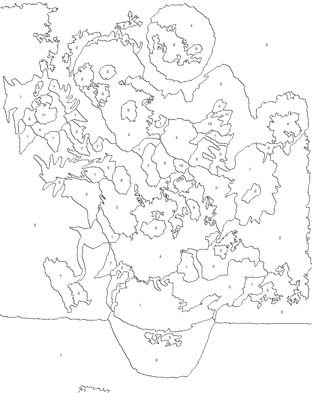
Simultaneous contrast is the change in how a color looks when other colors sit next to it: the same gray seems lighter on a dark ground and darker on a light one. The surrounding colors push the eye toward their opposite, so a neutral patch can look slightly tinted. Numbered color chips beside the picture let you compare each color on its own with the same color in context.
How to use simultaneous contrast
Choose a photo with side-by-side colors
Press “Choose a photo” and pick a picture where a small patch of one color sits inside a larger area of another, such as a bright flower on dark leaves.
Pick 8 or 12 colors
Start with 12 colors, or press 8 colors for fewer, larger shapes. Fewer colors give flat areas that make contrast between neighbors easier to see. “More settings” adjusts smoothness and the numbers.
Switch between numbers and colors
Use the view button to flip the picture between numbered shapes and filled colors. Then look at each color chip under the picture and compare it with the same color inside the picture.
Save the sheet and test your paints
Press “Download PNG” to save the sheet, or Pro for a PDF. Paint two neighboring numbers first, step back, and compare them with their chips before continuing.
Choose a photo that shows the effect
Look for a picture where one small area of color sits inside a much larger area of another color: a yellow petal against dark foliage, a gray rock on orange sand, a red scarf against a blue coat. Photos with many similar mid-tones give flat results and little to compare. Photos with a clear dark area, a clear light area and one or two strong colors show the most.
To study lightness alone, pick a photo with mostly gray or muted tones. To study hue, pick one with a strong color field such as a green lawn or a blue wall.
Build two quick demonstrations on paper
Simultaneous contrast is easy to prove with scissors and paper. Cut two identical squares from the same gray sheet. Lay one on black paper and one on white paper, then look at both from arm’s length. The square on black looks lighter and the square on white looks darker, although both are the same piece of gray.
Repeat with color. Place a neutral gray square on red paper and another on green paper. The gray on red tends to look a little greener, and the gray on green a little redder. Orange on yellow seems deeper and redder, while the same orange on red seems lighter and yellower.
Keep these samples next to your printed sheet. They remind the eye that a color is never read alone.
Try the hands-in-water test for the same idea in another sense
Fill three bowls: one cold, one warm, one hot. Put one hand in the cold bowl and the other in the hot bowl for a minute, then move both hands into the warm bowl. The hand from the cold bowl feels the water as warm, and the hand from the hot bowl feels it as cool. One bowl, two verdicts. Color works the same way: the eye reads a color against what it has just seen and what sits beside it.
Read the chips against their neighbors
The color chips under the picture show each number’s color on a plain ground. Put your finger over everything in the picture except one shape, then look at the chip. Remove the finger and look again. Any shift you notice comes from the surrounding colors.
Try the same test on a shape with a very dark neighbor and on another with a very light neighbor. The first tends to look brighter than its chip, the second duller. A shape between two strongly colored neighbors may look tinted toward the opposite of both.
Use a mask to see one color alone
Punch a small hole in a piece of gray or white card. Hold the card over a painted area, or over the screen, so only the hole shows. With the neighbors hidden, the color reads as it truly is. Take the card away and the color changes again. Repeat on three or four areas and the pattern becomes clear: dark surrounds lift a color, light surrounds lower it.
Check a paint mix before committing
Paint a small patch of each mix on scrap paper before filling a shape. Place the patch next to the neighboring colors from your sheet, and compare it with the chip from a normal viewing distance. If the patch looks too light or too dull beside its neighbors, adjust the mix, not the chip. A mix that matches the chip alone can still look wrong in place.
When a painted area looks off, cover its neighbors with a strip of plain paper and look again. If the area returns to its chip, the neighbors caused the shift and the paint is fine. A mix that was right on the palette and wrong on the canvas is the usual sign.
Work in an order that supports comparison. Paint two neighboring numbers first, step back, and judge them together. Large shapes carry most of the picture, so settle those before the small ones.
Pay attention to complementary pairs
Pairs such as red and green, blue and orange, or yellow and violet make each other look more intense when placed side by side. Where such a pair meets, the edge can seem to vibrate. A muted red looks richer beside a muted green than beside another red.
Use this deliberately. If a color looks flat, check its neighbors: a touch of the opposite color nearby can lift it without changing the paint itself. If two neighbors fight too much, soften one of them slightly rather than changing both.
Look at a bright color, then at white
Stare at a small red patch for about twenty seconds, then look at a white wall. A pale green ghost of the patch appears. The eye, tired of red, answers with its opposite. The same pull works while you paint: after long work on a strong color, the next color seems tinted with the opposite. Rest your eyes on a neutral gray for a few moments before judging a mix.
Test the ground your paint sits on
Paper that is not pure white acts as a large neighbor for every color on it. Lay the same paint swatch on white, cream and gray paper and compare the three. The swatch on cream looks cooler, and the one on gray looks brighter. When you paint on toned paper, mix and judge your colors on that same paper, not on a white sheet beside it.
Compare 8 colors with 12 or more
Save two versions of one photo, one with fewer colors and one with more. With fewer colors the shapes are larger and the contrasts between neighbors are stronger and easier to see. With more colors, neighboring shades are closer, and the effect shows up as small shifts within areas that look uniform.
Both are useful. Fewer colors teach the principle, and more colors show how skilled painters use small differences to build a soft transition.
When small shapes blend instead
Contrast is not the only effect. Very small or thin shapes of two colors, seen from a distance, can blend into one tone instead of pushing apart. A thin yellow line crossing a blue area can make the blue look slightly greener. Step back from the sheet to see it. Closer up, the colors separate again.
When a small numbered shape looks wrong, check whether it is too small to hold its own color against a large neighbor. Painting it a little stronger than its chip often brings the balance back at normal viewing distance.
Set up the viewing conditions
Judge colors under steady, neutral light and against a plain surround. A bright window behind the sheet, or a strongly colored wall beside it, adds its own contrast and shifts every judgment. Lay the chips on white or light gray paper, and look at sheet and chips from the same distance.
Landscape and portrait painters
In a landscape, a gray-green hill looks bluer against a warm orange sky and flatter against another green. In a portrait, a skin tone looks pinker beside a green wall and more yellow beside a violet scarf. Before repainting a face or a hill, change the surrounding area on a scrap and check whether the problem moves. Often the edge, not the middle, needs the correction.
Teach it in one session
One photo, one sheet per person and a set of paints are enough for a lesson. Ask each person to paint one shape beside two different neighbors, then write down what changed: lighter, darker, warmer or cooler. Compare results at the end. Different painters often choose different mixes for the same chip because they were reacting to different neighbors, which makes the effect visible without any explanation.
A second round works well: swap which shape is painted first. The order in which neighbors are laid down changes the choices people make. Letting each person bring their own photo gives every student an example drawn from colors they care about.
FAQ
What are examples of simultaneous contrast?
The classic example is two identical gray squares, one on a black background and one on white: the one on black looks lighter. Other examples are a gray patch on red that seems slightly green, and one orange that looks different on yellow than on red. A color chip next to its painted shape works the same way.
What is simultaneous contrast theory?
The theory says that the eye judges every color by comparison with what surrounds it, not alone. A light surround makes a color look darker, a dark surround makes it look lighter, and a strongly colored surround shifts a neutral toward the opposite color. Color perception is relative, which is why identical colors can seem different.
What creates simultaneous contrast in a painting?
Neighboring areas of different lightness or color create it. A small patch inside a larger field takes on the opposite of the field: a gray in red looks greener, a gray in blue looks warmer. The strongest effects appear where two very different colors meet along a shared edge.
Why does a color look different beside its neighbors than on its own?
The eye reads every color against what surrounds it, so the same paint can look lighter, darker or slightly tinted depending on its neighbors. Compare the numbered view with the colored view, and look at a color chip next to the painted shape. The paint is the same; the neighbors make the difference.
Does simultaneous contrast change only lightness, or hue too?
Both change. A surround alters how light or dark a color looks, and a strongly colored surround shifts hue and vividness toward the opposite color. A gray on orange can look bluish, and the same gray on black looks lighter than on white.
How do I stop it from fooling me when I mix paint?
Judge each mix in place, not alone. Paint a small patch beside the real neighbors, step back, and compare it with the chip. Covering the neighbors with plain paper then uncovering them shows how much the surroundings shift the color.
Updated
Related tools
- 10x10 gridPrint a blank 10x10 grid with 100 squares in three sizes. Add numbers 1 to 100, then print the sheet or save it as a clear PNG.
 4 Quadrant Graph PaperPrint free 4 quadrant graph paper with bold x and y axes, numbered both ways from 0. Pick square size and paper, then save as PDF, PNG or JPG.
- 8x8 gridPrint a free 8x8 grid of 64 squares in your browser. Pick Small, Medium or Large squares, add letters and numbers, then print or save a PNG.
 Add grid to photoAdd a grid to any photo in your browser, with no sign-up and no watermark. Get a numbered grid or a plain grid overlay, then save it or print it at true size.
- Ar TracingInstead of ar tracing with a phone stand, put a numbered grid on your own photo, then save or print it and copy it square by square. Free, no sign-up.
 Aspect Ratio CalculatorUse this aspect ratio calculator to turn a width and height into a ratio like 16:9. You also get the decimal and a resize that keeps the shape.
- Atmospheric PerspectiveAdd a numbered grid to a photo and compare near and far squares to see atmospheric perspective: lighter values, softer color. Free, in your browser.
- Bargue DrawingPractice Bargue drawing from your own photo: add a numbered grid with 5, 8 or 12 squares across, then save it or print a gridded sheet and an empty one.