What is visual weight, and how do I see it in my photo?
Choose a JPG, PNG, WebP or iPhone HEIC photo to see it split into nine equal parts.
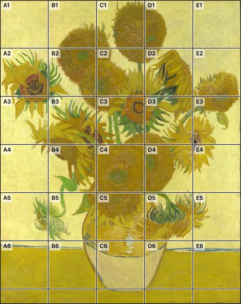
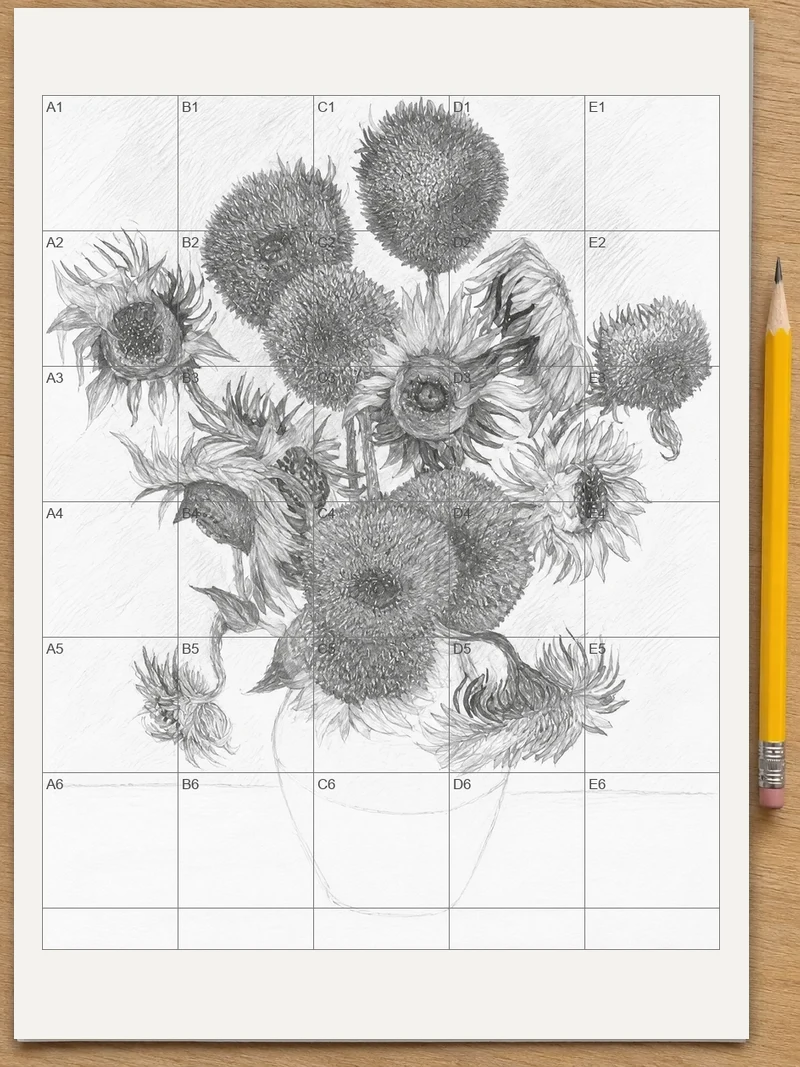
Visual weight is how strongly a part of a picture pulls the eye, and you can see it in your own photo by comparing nine equal parts one by one. Choose a photo, and two vertical and two horizontal lines split it at once. Judge each part, then save or print the result.
Visual weight is the pull an element has on the viewer's eye. Dark, bright, saturated, large, sharp or isolated elements feel heavy, and quiet, soft or small ones feel light. Neither high nor low is better: a photo works when the heavy and light parts are arranged on purpose.
How to use visual weight
Choose a photo
Press “Choose a photo” and pick a JPG, PNG, WebP or iPhone HEIC picture. On a computer you can also drag the photo onto the page. The grid appears right away.
Compare the nine parts
Two vertical and two horizontal lines divide the photo into nine equal parts with the photo's own shape. Look at each part and note which one holds your eye longest.
Make the lines easy to see
If the lines blend into the picture, open “Adjust grid” and change the line color, thickness or opacity. Black, white or any color you pick is available.
Save or print
Press “Save to Photos” on a phone or “Download” on a computer to keep the gridded picture. “Print” gives two sheets: the photo with its grid, then an empty grid for notes.
Prepare the photo before you judge it
Look at the whole frame first, not at the subject you already know is there. Step back from the screen or hold a phone at arm's length. Then squint until fine detail dissolves.
What remains are the big dark shapes, bright patches and strong colors, and those are the elements doing the work. Write down the first three things your eye touches. Those three are your starting list of heavy elements.
Read the nine parts one at a time
Work through the grid in reading order, left to right and top to bottom. For each part, ask one question: does this part hold my eye, or let it pass? Mark the parts as heavy, medium or light, with a small pencil note on a printed copy or a note on paper.
Then compare halves. Add up the left three parts against the right three, and the top three against the bottom three. A photo does not need equal totals, but a big gap should be a decision. Also check the four points where the lines cross. A heavy element near one of those points usually reads as placed with intent.
Know what adds weight
You can predict where the eye will go by checking a short list.
Light and dark
The strongest contrast in the frame usually wins. A bright window in a dim room, or a dark tree trunk against pale sky, pulls harder than any detail around it.
Color
A saturated color against muted surroundings is heavy. A red scarf in a street of gray and brown outweighs a much larger beige wall.
Size and position
Larger shapes weigh more, and shapes far from the center weigh more than shapes near it, much like a person sitting at the end of a seesaw. A small subject near an edge can balance a large mass near the middle.
Focus and sharpness
Sharp areas draw the eye and soft areas let it go. A blurred background keeps its weight low so the sharp subject carries the frame.
Empty space
Open areas of sky, water or wall feel light. They give a heavy subject room, and they can balance it when placed opposite.
Decide whether a heavy part helps or hurts
A heavy part helps when it holds your subject. A portrait with the face in a bright, sharp part and soft shadows around it leads the eye straight where you want it.
A heavy part hurts when it belongs to something unimportant. Typical examples are a bright sign at the edge of a street scene, a dark branch cutting into a corner, or a patch of overexposed sky in the top row. If your eye keeps leaving the subject for such a part, that part carries too much weight.
Fix an imbalance
Pick the smallest change that moves weight where you want it.
After each change, put the grid on the new version and ask the same question of the same nine parts. Comparing two versions part by part shows quickly whether the change moved the weight or only moved the subject.
- Crop or reframe so a distracting bright area is cut or pushed to a smaller part of the frame.
- Move the subject, or yourself, so a large light area balances a large dark one.
- Darken or soften a bright edge in an editor, or lighten a shadow that sinks one side.
- In a drawing, keep the strongest darks and sharpest edges for the area you want seen first, and keep the rest quieter.
Use the gridded photo when you draw or paint
Artists use the same reading before starting a study. On the printed photo, shade the heaviest parts lightly with a pencil. On the empty grid sheet, block in those parts first with large shapes, then add the lighter parts around them. The nine-part layout keeps your eye honest about how much of the sheet each heavy area takes.
Practice on varied pictures
Try the grid on pictures of very different kinds. A seascape with a small boat and wide sky shows how empty space balances a tiny subject. A close portrait shows how a face outweighs everything around it. A busy market scene shows weight scattered across many parts, so the eye wanders. Reading ten of your own photos this way trains your sense of weight faster than reading any rule about it.
FAQ
How do I figure out the visual weight of a photo?
Look at the photo and ask which areas your eye lands on first and leaves last. Squinting helps, because detail blurs and only the big dark, bright and colorful shapes remain. With a thirds grid on top, compare the nine parts and note which feel heavy, which feel light, and where the balance tips.
What does visual weight mean?
Visual weight means how much attention a part of an image draws compared with the rest. A small red object on a gray wall can feel heavier than a large gray shape beside it. Photographers and painters use the idea to guide the eye and to judge whether a composition feels balanced.
Is it better to have high or low visual weight?
Neither is better; what matters is how the weight is spread. A photo with one very heavy subject can be strong if the lighter areas support it. Trouble starts when a heavy element sits where you did not intend, such as a bright patch at the edge pulling the eye away.
What adds visual weight to an image?
Strong contrast, bright or saturated color, larger size, sharp focus and a position far from the center all add visual weight. Isolation helps too: a lone object in empty space feels heavier than the same object in a crowd. Faces and figures also draw the eye more than objects of equal size.
How can visual weight affect an image?
Visual weight decides where the eye goes first, where it rests and whether the frame feels steady. Heavy elements crowded on one side make the picture feel lopsided, while weight spread across the frame feels calm. Placing weight on purpose lets you lead the viewer to your subject.
Updated
Related tools
- 10x10 gridPrint a blank 10x10 grid with 100 squares in three sizes. Add numbers 1 to 100, then print the sheet or save it as a clear PNG.
 4 Quadrant Graph PaperPrint free 4 quadrant graph paper with bold x and y axes, numbered both ways from 0. Pick square size and paper, then save as PDF, PNG or JPG.
- 8x8 gridPrint a free 8x8 grid of 64 squares in your browser. Pick Small, Medium or Large squares, add letters and numbers, then print or save a PNG.
 Add grid to photoAdd a grid to any photo in your browser, with no sign-up and no watermark. Get a numbered grid or a plain grid overlay, then save it or print it at true size.
- Ar TracingInstead of ar tracing with a phone stand, put a numbered grid on your own photo, then save or print it and copy it square by square. Free, no sign-up.
 Aspect Ratio CalculatorUse this aspect ratio calculator to turn a width and height into a ratio like 16:9. You also get the decimal and a resize that keeps the shape.
- Atmospheric PerspectiveAdd a numbered grid to a photo and compare near and far squares to see atmospheric perspective: lighter values, softer color. Free, in your browser.
- Bargue DrawingPractice Bargue drawing from your own photo: add a numbered grid with 5, 8 or 12 squares across, then save it or print a gridded sheet and an empty one.