What is chiaroscuro, and how do I draw it from a photo?
Chiaroscuro is the use of strong light against deep shadow to make forms look solid, and you can study it by choosing a photo that turns into a pencil sketch right in your browser. Soft grey strokes trace the outlines and the edges where light turns to shadow, while flat areas, light or dark, stay white. You see the shape of each shadow before you fill it in yourself. The sketch downloads as a free PNG, and the photo never leaves your device.
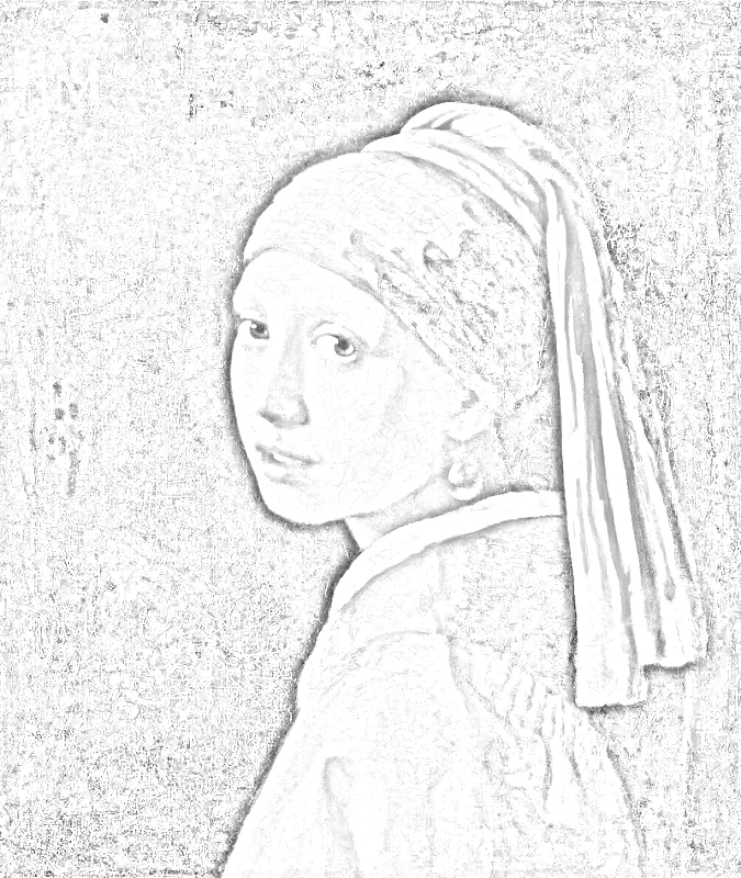
Chiaroscuro, from the Italian for “light-dark,” is a way of drawing and painting where bright areas and deep shadows sit side by side so shapes seem to have weight. Choose a photo lit from one side and the sketch traces where light meets shadow as grey strokes on white. Fill in those shadow shapes yourself to plan your shading.
How to use chiaroscuro
Choose a photo
Press “Choose a photo” and pick a picture lit from one direction. JPG, PNG, WebP and iPhone HEIC files open.
Read the sketch
The pencil sketch appears at once. Flat areas, light or dark, come out white, and grey strokes mark the edges where light meets shadow. Tap “Line drawing” if you would rather see clean black outlines.
Adjust the strokes
Open “More settings” to change stroke width, darkness and smoothing until the edges of the main shadow shapes stand out clearly and small marks do not distract you.
Download and draw
Press “Download PNG” to save the sketch at 1500 pixels on its long side, with no watermark. Keep it beside your paper and shade your own version from it.
Pick a photo that already has strong light
Look for a single source: a window beside a face, a desk lamp over a book, a candle on a table. One source gives shadows that fall in the same direction, which is what chiaroscuro depends on. A photo lit evenly from every side gives a sketch with few shadow shapes to follow, so turn off the overhead light and photograph the subject again if you can.
A plain background helps. Flat areas come out white in the sketch whether they are light or dark, so a busy background only adds strokes that are not part of your subject.
Squint before you shade
The sketch shows where each shadow begins, but a large dark area inside it comes out white. Open “More settings” and turn on “Show my photo” to see how dark it really is.
Hold the photo at arm’s length and half close your eyes. Small details fade, and a few large dark shapes remain. Draw those first, lightly, inside the edges the sketch traces, and leave the bright areas as bare paper. Beginners often start with detail and run out of contrast; starting with the big shadow shapes keeps the drama.
Build the darks gradually
Lay a light tone over every shadow, then return to the darkest areas, such as the hollow under a chin, the side of a jug away from the lamp, or the fold of cloth, and press harder there. Keep the lightest highlight untouched. Blend the middle tones with a finger or a paper stump, but keep the edge between lit and shaded areas crisp where the light is hard.
Use the line drawing for placement
Switch to the line version when you only need the outline of the subject. Copy the contours first so the proportions are right, then take the grey pencil version as your guide for where each shadow begins. Two files, one for shape and one for shadow, keep each stage simple.
Try tinted paper
Drawing on mid-toned paper is a classic way to practice. The paper itself serves as the middle tone, dark pencil or charcoal handles the shadows, and white chalk or a white pencil adds only the brightest highlights. Because half the tonal range is already supplied, the drawing builds quickly and the contrast reads strongly.
Compare with the original
After an hour at the desk, put your drawing next to the photo and look for the places where the shadow edge is soft or hard. Matching those edges does more for realism than adding detail. If the whole drawing looks flat, deepen the darkest area one more time and see how the lights seem to brighten without any extra work.
FAQ
What does chiaroscuro literally mean?
Chiaroscuro literally means “light-dark” in Italian. It joins chiaro, meaning clear or bright, with scuro, meaning dark or obscure. In art the word describes strong contrast between lit and shaded areas, used to give figures and objects a rounded, three-dimensional look.
Who is famous for chiaroscuro?
Painters and printmakers of the Renaissance and Baroque periods are the ones best known for chiaroscuro. The easiest way to see their method is to study any old painting where one bright light falls on a figure against a dark ground. Then choose a photo with that same lighting and read where its shadows begin in the sketch.
Is Mona Lisa chiaroscuro?
The Mona Lisa is usually described as sfumato rather than dramatic chiaroscuro. Leonardo does model the face with light and shade, but the shifts are so gentle that no hard edge appears. A scene with one bright lamp and black surroundings is closer to chiaroscuro.
What is the difference between chiaroscuro and sfumato?
Chiaroscuro sets light and dark against each other for contrast and drama, while sfumato blends tones so softly that outlines seem to melt like smoke. Both model volume with shading. Chiaroscuro makes the contrast obvious, and sfumato hides the transitions.
Updated
Related tools
- 10x10 gridPrint a blank 10x10 grid with 100 squares in three sizes. Add numbers 1 to 100, then print the sheet or save it as a clear PNG.
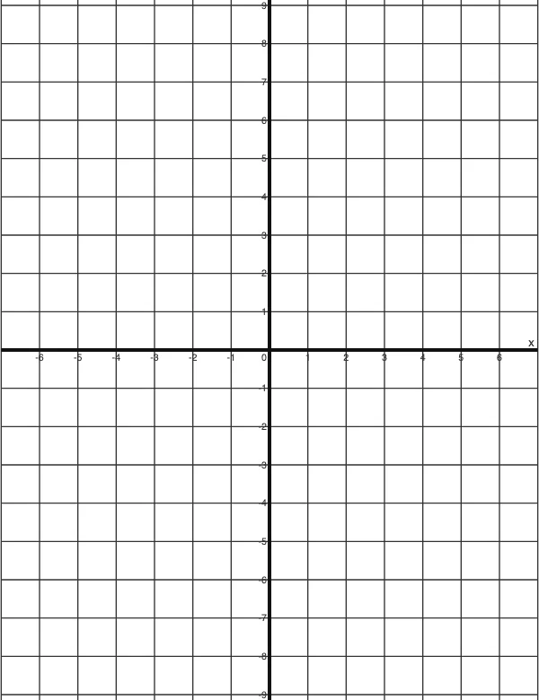 4 Quadrant Graph PaperPrint free 4 quadrant graph paper with bold x and y axes, numbered both ways from 0. Pick square size and paper, then save as PDF, PNG or JPG.
- 8x8 gridPrint a free 8x8 grid of 64 squares in your browser. Pick Small, Medium or Large squares, add letters and numbers, then print or save a PNG.
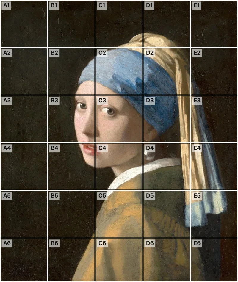 Add grid to photoAdd a grid to any photo in your browser, with no sign-up and no watermark. Get a numbered grid or a plain grid overlay, then save it or print it at true size.
- Ar TracingInstead of ar tracing with a phone stand, put a numbered grid on your own photo, then save or print it and copy it square by square. Free, no sign-up.
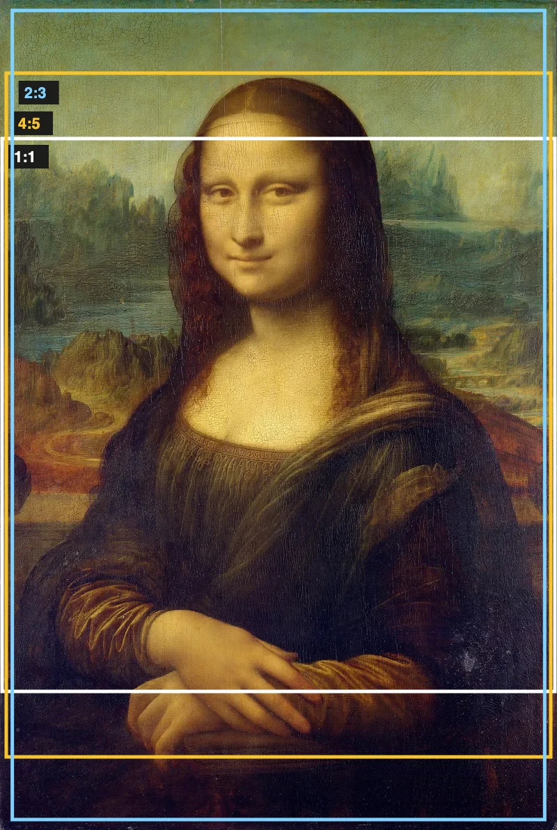 Aspect Ratio CalculatorUse this aspect ratio calculator to turn a width and height into a ratio like 16:9. You also get the decimal and a resize that keeps the shape.
- Atmospheric PerspectiveAdd a numbered grid to a photo and compare near and far squares to see atmospheric perspective: lighter values, softer color. Free, in your browser.
- Bargue DrawingPractice Bargue drawing from your own photo: add a numbered grid with 5, 8 or 12 squares across, then save it or print a gridded sheet and an empty one.