How can I print a free calligraphy practice sheet?
A4 paper. Small letters are 5 mm tall, with 11 rows of lines and the slanted lines at 55 degrees.
This page is where you print a free calligraphy practice sheet. Choose a letter size, then print the sheet on Letter or A4, or save it as a PDF, PNG or JPG. Every row has four guide lines, and slanted lines run across the page to keep your strokes at one angle. No sign-up is needed.
More settings
Yes, a calligraphy practice sheet is free here, with no account and no email address. Pick Small, Medium or Large letters, then print the sheet or save it as a PDF, PNG or JPG. The slant of the lines is 55° at first, and More settings offers 85° and 90°. The page fills with as many whole rows as fit on the paper.
How to print a calligraphy practice sheet
Choose a letter size
Pick Small, Medium or Large. The size sets the height of the small letters. It runs from 1/8 inch to 1/4 inch on Letter, or from 3 mm to 7 mm on A4.
Choose a slant
Steep (55°) is the start. Open More settings and set Slant to Slight (85°) or Upright (90°). The slanted lines across each row follow the angle you choose, so you can see the lean you will be writing against.
Check the paper
Letter or A4 is picked from your browser’s region. More settings offers A3, Legal, a 21 cm square page, page direction, line width and space round the edge.
Print or save the sheet
Press the print button, or save the sheet as a PDF. Print at actual size (100%), not fit to page. The PNG and JPG options sit under More settings. Print several copies so each drill gets a fresh page.
Match the letter size to your pen
Start with Large if the pen makes thick or soft strokes, such as a brush pen or a broad felt-tip. The tall rows give a wide stroke room to turn without touching the next line. A fine nib or a sharp pencil can work on Medium, where the small letters are 3/16 inch (5 mm on A4). Save Small, at 1/8 inch (3 mm on A4), for the day when your letters already sit evenly between the waist line and the baseline.
Pick the slant for the hand you are learning
The slant is under More settings and starts at Steep. Choose Steep, 55°, when you are working toward Copperplate. The angle is steep on purpose, and the slanted lines show how far each downstroke should lean. Choose Slight, 85°, for italic-style writing, where letters lean just a little. Choose Upright, 90°, when you want vertical strokes, for example to learn letter shapes before adding any lean.
If you are unsure, print one page of each. Write the same line on all three and keep the one that feels most natural to your wrist.
Know where each letter lives
The rows give every part of a letter a place to go:
Because the ascender and descender spaces are each 1.5 times the small-letter height, the tall and deep parts of your letters get a consistent proportion. Compare the loop of an l to the loop of a g: they should look like mirror images in height.
- letters such as a, c, e, m and o sit between the waist line and the baseline
- letters such as b, d, h, k and l rise to the ascender line
- letters such as g, j, p, q and y drop to the descender line
Use the slanted lines as a ruler
Do not trace the lines. Instead, let your eye follow them. After you write a letter, hold a pencil along its main downstroke. If the pencil runs parallel to the nearest slanted line, the stroke has the right angle. If it crosses the line, note which way it drifts, then correct that on the next letter.
The slanted lines stand two small-letter heights apart along the baseline. Use them to keep the space between letters even as well as the lean.
Warm up before writing words
Spend the first few rows on drills rather than the alphabet. Fill a row with a single stroke: a straight downstroke, a curve to the right, an oval, a connected run of loops. Keep each stroke between the baseline and the waist line, then repeat the drill in the ascender and descender spaces. These shapes repeat inside nearly every letter, so a clean row of ovals already improves your a, d and g.
Print a few copies and change the job of each
One page can have several purposes if you print more than one:
When a page works well, save it as a PDF so the same layout comes back next time.
- a first copy for pencil, where mistakes cost nothing
- a second copy for your chosen pen, once the pencil rows look even
- a third copy for a real line of text, such as practice for an envelope or a short saying
Prepare the paper and the printer
Load Letter or A4 paper in the tray to match the sheet you made. Set the print scale to 100% (actual size), not fit to page, so the small letters keep the height shown. If your pen bleeds on thin office paper, load a smoother, heavier sheet before printing.
Practice a little, often
Short sessions teach the hand more than one long evening. Fill a row or two, step away, then look at the page again. Gaps between letters, wobbly baselines and uneven slants show up much more clearly after a break. Mark the row you like best with a small tick so you can see your own progress over several sheets.
Move from lines to a finished piece
When the rows look steady, write a full word, then a short line. Keep tall letters inside the ascender line and tails inside the descender line. A line you are proud of can go onto a card or label once the lettering is steady. Until then, keep the blank sheet close by, and print a new one as soon as the old one is full.
FAQ
Can I download a calligraphy practice sheet as a PDF without signing up?
Yes. Choose a size, then press “Save as a PDF.” No account, email address or app is needed, and the sheet is free. PNG and JPG files are under More settings if you would rather have a picture.
Is there a sheet with the right slant lines for Copperplate?
Yes. The slant starts at Steep, 55°, the Copperplate angle, measured up from the baseline. Change it under More settings. Slight is 85°, which is 5° off upright and suits italic hands. Upright is 90° for plain vertical lines.
What are the four lines in each row?
Each row has an ascender line, a waist line, a baseline and a descender line. The waist line marks the top of the small letters, and the baseline is a little thicker. The three spaces between lines follow a 3 to 2 to 3 shape.
Can I use regular pens on a calligraphy practice sheet?
Yes, any pen that marks paper works, because the sheet is only printed lines. A pencil, a felt-tip or a brush pen is fine for learning the shapes. A smooth, heavier paper in your printer helps if you later use ink.
How do I print it at the right size?
Set the print scale to 100% and turn off fit to page. Scaling changes the height of the small letters, so the sheet would no longer match the size shown under the sizes. Hold a ruler against one printed row to check.
Which letter size should a beginner choose?
Large is the easiest place to begin. Its small letters are 1/4 inch tall on Letter or 7 mm on A4, so each curve has room and wobbles are easy to see. Move to Medium or Small once your strokes feel steady.
Can I type my own name or a quote onto the sheet?
No. This sheet is blank, with guide lines only, so you write the words yourself. Print it, then copy a name or a favorite line onto the rows by hand, checking each letter against the slanted lines.
Updated
Related tools
- 10x10 gridPrint a blank 10x10 grid with 100 squares in three sizes. Add numbers 1 to 100, then print the sheet or save it as a clear PNG.
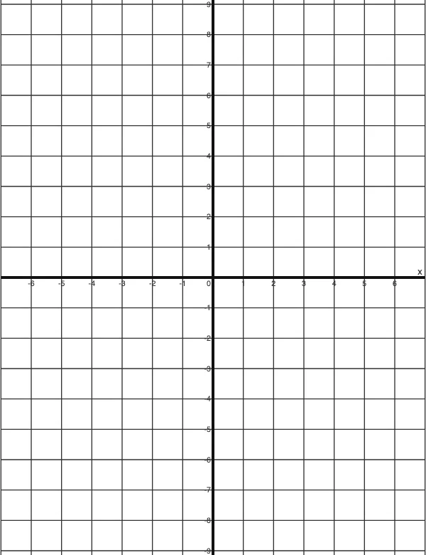 4 Quadrant Graph PaperPrint free 4 quadrant graph paper with bold x and y axes, numbered both ways from 0. Pick square size and paper, then save as PDF, PNG or JPG.
- 8x8 gridPrint a free 8x8 grid of 64 squares in your browser. Pick Small, Medium or Large squares, add letters and numbers, then print or save a PNG.
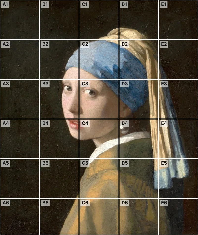 Add grid to photoAdd a grid to any photo in your browser, with no sign-up and no watermark. Get a numbered grid or a plain grid overlay, then save it or print it at true size.
- Ar TracingInstead of ar tracing with a phone stand, put a numbered grid on your own photo, then save or print it and copy it square by square. Free, no sign-up.
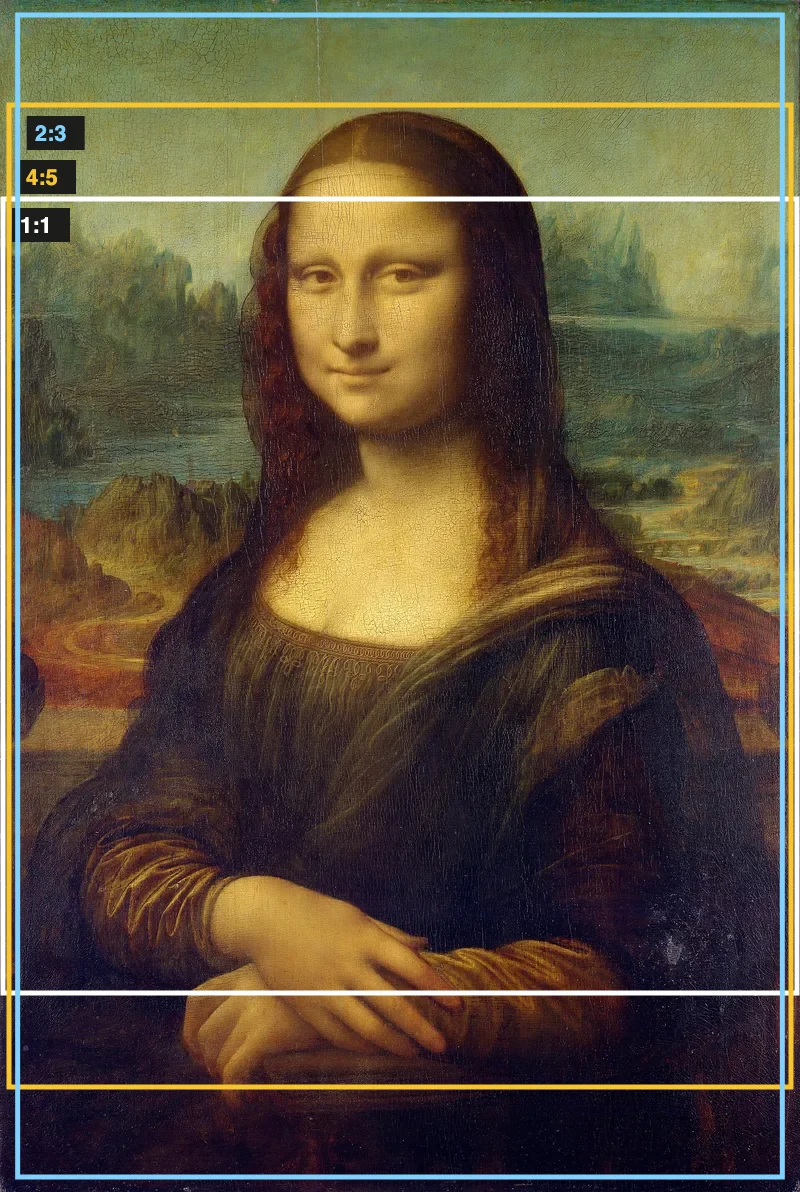 Aspect Ratio CalculatorUse this aspect ratio calculator to turn a width and height into a ratio like 16:9. You also get the decimal and a resize that keeps the shape.
- Atmospheric PerspectiveAdd a numbered grid to a photo and compare near and far squares to see atmospheric perspective: lighter values, softer color. Free, in your browser.
- Bargue DrawingPractice Bargue drawing from your own photo: add a numbered grid with 5, 8 or 12 squares across, then save it or print a gridded sheet and an empty one.